Top performing ads & creatives.
Built to put advisors in front of the right prospects.

Each piece is tailored to your ideal client, so your ads attract the right prospects and fill your pipeline with meaningful conversations.

Recent Top Performing Video Ads

These aren't spec work. Every format below ran on Meta and generated real leads. We use a mix of styles because different prospects respond to different things. What they all have in common: they're built around your ideal client, not a generic audience.

Looks like a regular post — performs better because of it
Shot to look organic, not produced. On most campaigns, this format outperforms polished video ads because it doesn't look like an ad. The prospect stops scrolling because it feels like something a real person shared, not a company pitch.
Achieved $13/lead · Final Expense
Short office video — the credibility play
An advisor on camera, speaking directly to the prospect from their office. We keep it under 30 seconds because that's what mobile feed demands. The office setting alone does a lot of the qualifying work. It signals legitimacy before the prospect even clicks.
Achieved $21/lead · Family Market
Animated text ad — no talking head required
We kept this one deliberately simple: motion and on-screen text, nothing polished. That's the point. It doesn't look like a typical ad, which is why it gets treated like content. The coverage quote examples were the hook that got people clicking, and animated ads like this became our top performing format for 2025 and into 2026, consistently the lowest cost per lead we've seen.
Achieved $8/lead · Family Market
Targeted animated ad — Atlantic Canada
Same animated format, built for Reels and Stories. The hook calls out the target audience and the text uses specific qualifiers that pull in the right prospect while filtering out the wrong one. That specificity is what drove this format to our lowest cost per lead.
Achieved $9/lead · Seniors Life Insurance
Advisor speaks to camera — the third bucket
The advisor leads with something the prospect hasn't heard before, which earns attention fast. Specific numbers make the concept feel real rather than abstract, and addressing the obvious objection upfront removes the friction before it has a chance to build. By the time they click, they're already curious and invested.
Achieved $27/lead · Permanent Life Insurance

Recent Top Performing Image Ads

These ran across real client campaigns — different audiences, different markets, different hooks. What they share is a clear message, a specific prospect in mind, and a reason to click.

Same hook, lifestyle angle — A/B variation
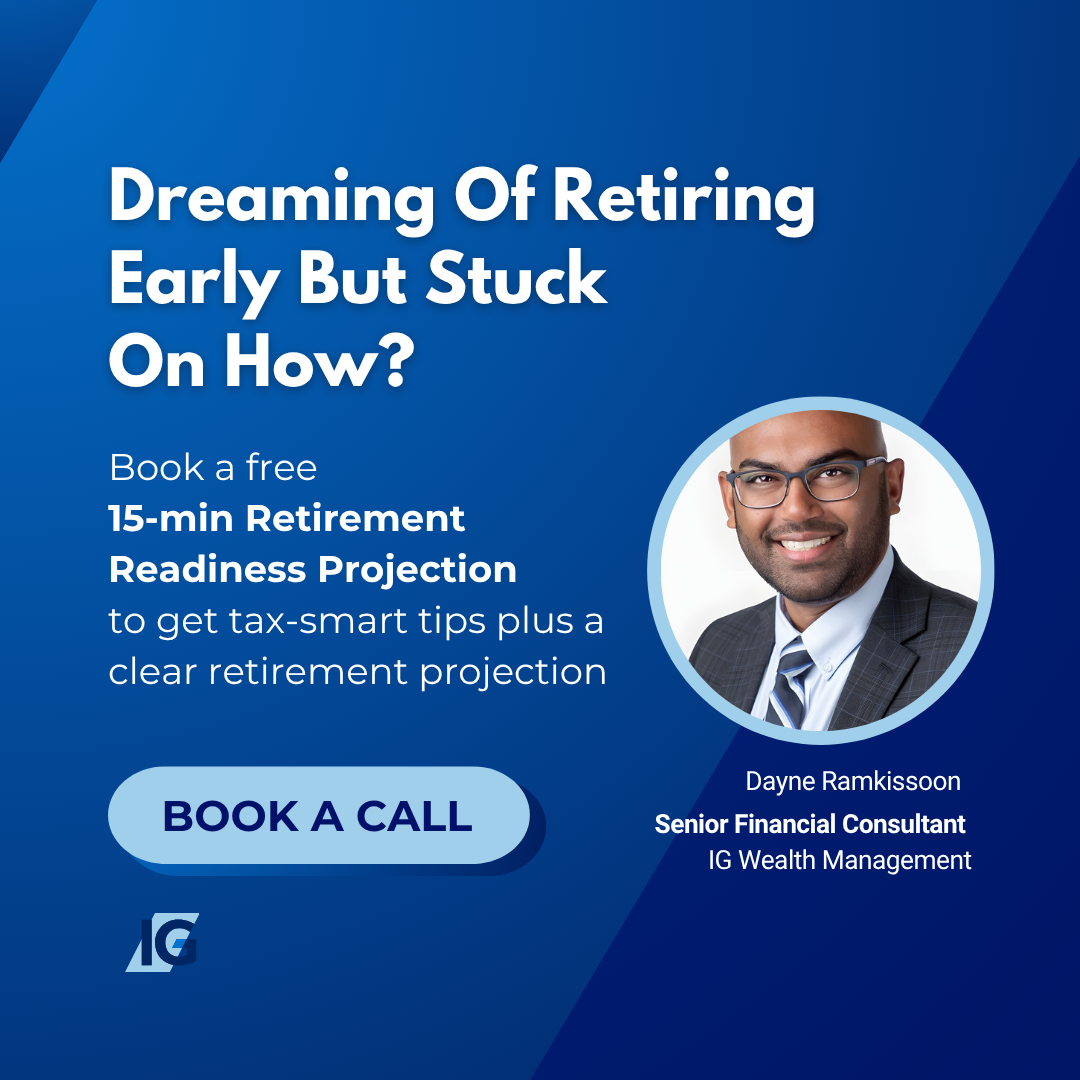
Desire-based hook — the dream and the obstacle
The headline doesn't just name what the prospect wants. It names the exact friction standing between them and it. That combination of aspiration and obstacle is what earns the stop. The advisor's face adds a personal, human element that a brand alone can't replicate.
Location-targeted — life insurance, Atlantic Canada
Geographic targeting creates immediate relevance. The prospect feels like the ad was made for them, not broadcast to everyone. Putting specific dollar amounts on the coverage makes the benefit concrete and easy to grasp, rather than leaving people to wonder what they'd actually get.
Side-by-side timeline — 9 years is the message
Side-by-side comparison — the visual makes the case
The format does the explaining without needing a long pitch. Showing two paths side by side (one optimized, one not) gives the prospect a clear picture of what's possible and makes the benefit of acting feel tangible. That kind of visual contrast moves people in a way that body copy alone rarely does.
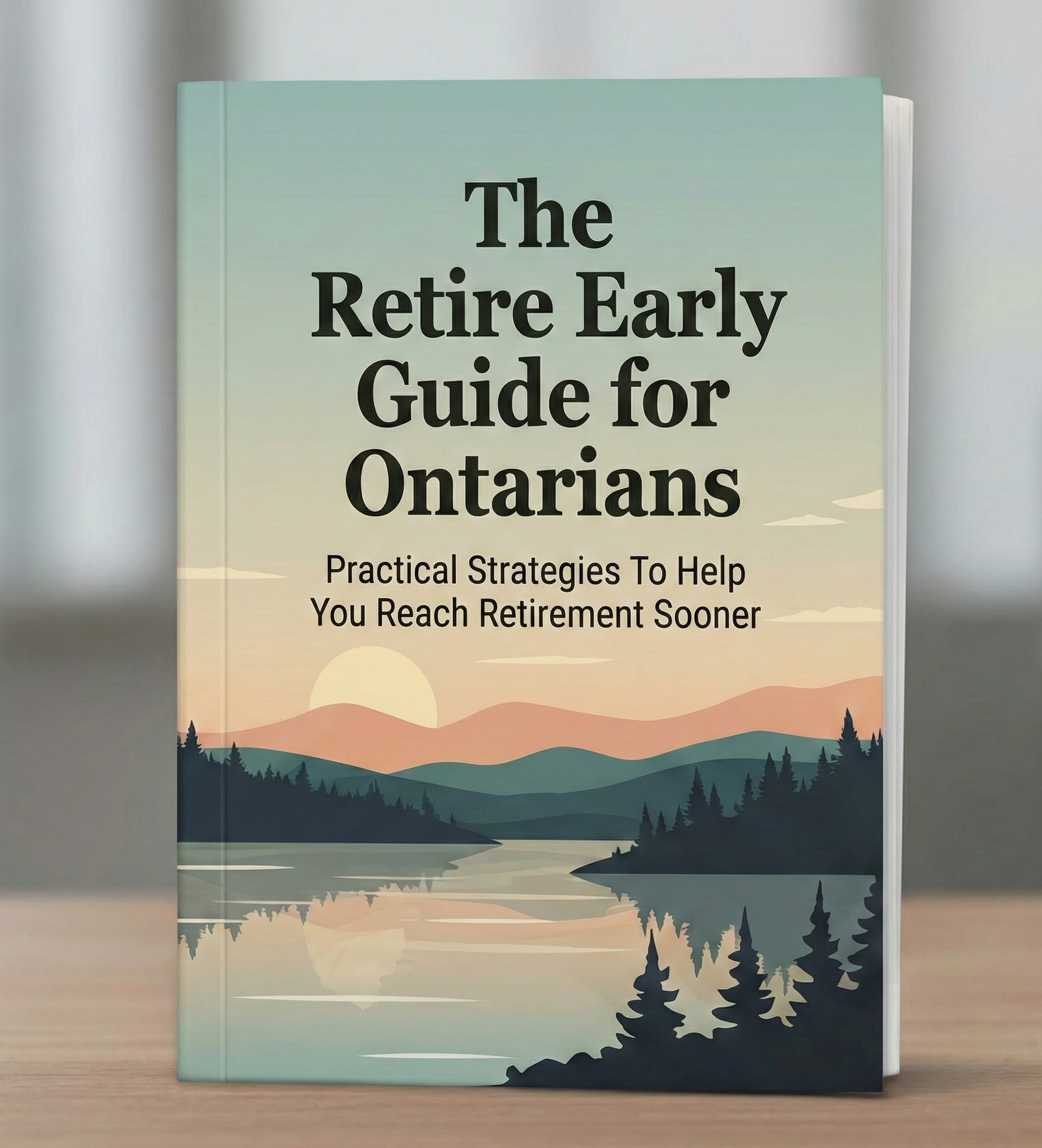
Lead magnet — the Retire Early Guide for Ontarians
A physical-looking book cover creates perceived value that a plain download link doesn't. We ran this for a wealth management professional targeting clients with $250K+ in investible assets. The guide educated and built trust before the call, which noticeably improved the quality of conversations the advisor was having.

Sample Landing Pages

Examples of how we build landing pages around a specific niche, offer, or audience. Each one is designed to pre-qualify prospects before they reach your calendar.

* These pages are for demonstration purposes only and are not from active client campaigns.

View Page
Lead Magnet Funnel (Sample)
A value-first opt-in page built to attract and qualify the right prospect. Low friction, high intent by the time they book.
Open full page
View Page
Explainer Video Funnel (Sample)
Built around a specific pain point relevant to the advisor's target market. Warms up the prospect and pre-sells the conversation before the discovery call.
Open full page

Sample Lead Magnet

A lead magnet does the heavy lifting before the advisor ever picks up the phone. The right one educates the prospect on a problem they didn't fully understand, builds credibility around the advisor's expertise, and warms them up so the first conversation already has momentum behind it. This approach works especially well with sophisticated clients, particularly business owners and incorporated professionals, who respond to depth and specificity over generic outreach. Here's an example of how we built one for that niche.

View Guide
Free Strategy Guide · 2025 Edition
The Corporate Asset Transfer Blueprint (Sample)
Built for incorporated Canadian business owners, one of the highest-value segments a financial advisor can target. The guide walks them through a CRA-approved strategy for redirecting corporate tax dollars into tax-sheltered wealth. By the time they finish reading, they understand the problem, trust the framework, and want to speak with someone who can implement it for them.
View guide

* This guide is for demonstration purposes only and is not from an active client campaign.